프로젝트
[Styled-components] 슬라이드 토글 버튼 만들기
기절초뿡
2022. 10. 26. 21:42

프로젝트에 댓글을 정렬할 때 사용할 토글 버튼이 필요했다. 그래서 디자이너 님께서 주신 디자인을 바탕으로 슬라이드 토글 버튼을 만들어보았다. 여기서는 React, TypeScript, Styled-Components 를 사용했다.

🔥 우선 tsx 코드 부터!
const ToggleButton = () => {
  const [latestSort, setLatestSort] = useState(true);

  const toggleHandler = () => {
    setLatestSort((prev) => !prev);
  };

  return (
    <div>
      <input type="checkbox" id="toggleBtn" onChange={toggleHandler} />
      <label htmlFor="toggleBtn" latestSort={latestSort} />
    </div>
  );
};
- 기본값을 '최신순' 정렬으로 할 것이므로 latestSort 라는 이름으로 state를 만들었다.
- toggleHandler 함수는 latesSort의 state를 토글하는 함수이다.
- checkbox input과 label을 사용하여 UI를 구현하였다.
- checkbox input의 value(checked, unchecked) 상태가 바뀔 때마다 label UI가 바뀌도록 구현한다. 예를 들어 checked에서 unchecked로 상태가 바뀔 때, toggleHandler 함수가 호출되어 latesSort의 state를 반전시키는 로직이다.
- input은 display:none으로 숨길 것이기 때문에 id와 htmlFor로 꼭 연결해준다.
🔥 🔥 이제부터 스타일링! 진짜로 UI를 구현해보자!

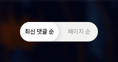
토글 스위치에서 뒷배경 부분(track 부분)은 label을 통해서 구현하고, 움직이는 동그란 스위치 부분은 label::after 로 구현한다. state가 바뀔 때마다 after 요소의 위치를 좌우로 바꾸어 움직임을 표현할 것이다. before 요소도 마찬가지로 state가 바뀔 때마다 좌우로 이동하지만 after 요소와는 반대로 이동한다. transition을 주면 위처럼 자연스럽게 구현 가능하다
import React, { useState } from 'react';
import styled from 'styled-components';

type ToggleType = {
  latestSort: boolean;
};

const ToggleButton = () => {
  const [latestSort, setLatestSort] = useState(true);

  const toggleHandler = () => {
    setLatestSort((prev) => !prev);
  };

  return (
    <BtnWrapper>
      <CheckBox type="checkbox" id="toggleBtn" onChange={toggleHandler} />
      <ButtonLabel htmlFor="toggleBtn" latestSort={latestSort} />
    </BtnWrapper>
  );
};

export default ToggleButton;

const BtnWrapper = styled.div`
  display: flex;
  z-index: 0;
`;

const CheckBox = styled.input`
  display: none;
`;

const ButtonLabel = styled.label<ToggleType>`
  z-index: 10;
   /* 만들고자 하는 button 의 크기와 색상 */
  width: 12rem;
  height: 3rem;
  border-radius: 2em;
  background-color: ${(props) => props.theme.colors.grey5};

 /* state가 false일 때의 before */
  ::before {
    display: flex;
    position: absolute;
    content: '최신 댓글 순';
    padding-left: 1em;
     /* 좌측에 text가 오게하기 위함 */
    justify-content: flex-start;
    align-items: center;
     /* before 요소가 이동할 경로의 길이만큼 width 지정 */
    width: 10rem;
    height: 3rem;
    color: ${(props) => props.theme.colors.grey1};
    font-size: ${(props) => props.theme.fontSize.body02};
    font-weight: ${(props) => props.theme.fontWeight.regular};
    line-height: ${(props) => props.theme.lineHeight.lh20};
    transition: all 0.2s ease-in-out;
  }
 /* state가 false일 때의 after */
  ::after {
    display: flex;
    position: relative;
    content: '페이지 순';
    width: 6rem;
    height: 3rem;
    justify-content: center;
    align-items: center;
     /* false일 때는 우측에 있어야하므로 전체 길이의 반만큼 이동한 상태 */
    left: 6rem;
    font-weight: ${(props) => props.theme.fontWeight.bold};
    font-size: ${(props) => props.theme.fontSize.body02};
    line-height: ${(props) => props.theme.lineHeight.lh20};
    border-radius: 2rem;
    background: ${(props) => props.theme.colors.white};
    box-shadow: 1px 2px 8px rgba(0, 0, 0, 0.16);
    transition: all 0.2s ease-in-out;
  }

  /* state가 true일 때 */
  ${(props) =>
    props.latestSort &&
    `
    &::before {
      padding-right: 1rem;
      content: '페이지 순';
       /* 우측에 text가 오도록 하기 위함 */
      justify-content: flex-end;
    };
    &::after {
      content: '최신 댓글 순';
      width: 6rem;
      height: 3rem;
       /* true일 때는 좌측에 있어야함 */
      left: 0rem;
    }
  `}
`;